Problem
Sea Forager had a great product but their website wasn’t making it easy for people to sign up. The subscription options were confusing, delivery details were hard to find, and the story behind their sustainable approach got lost in the clutter. Potential customers ended up leaving the site unsure of what they were getting.
Solution
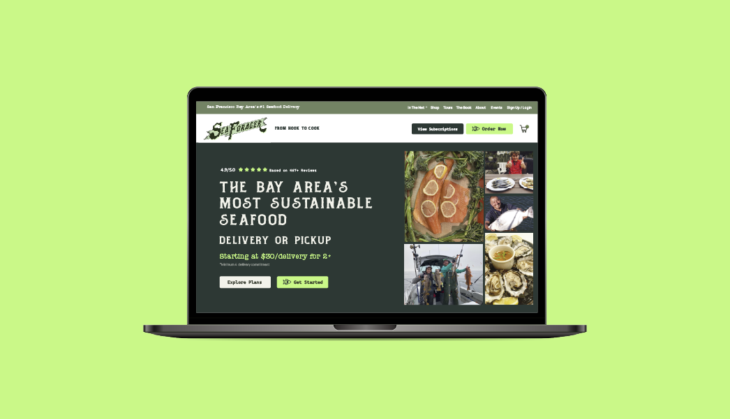
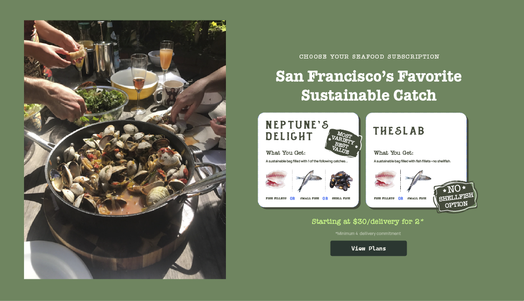
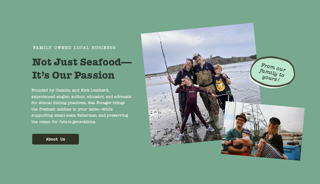
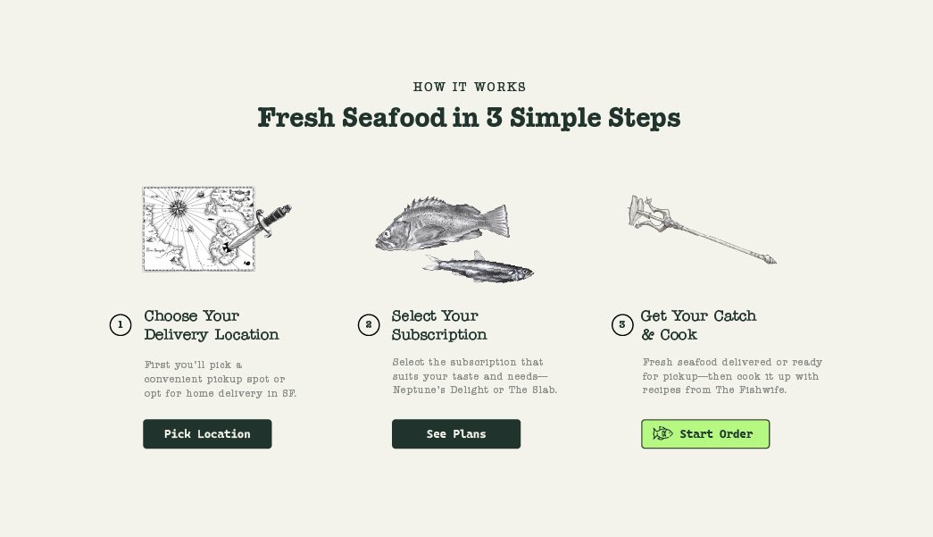
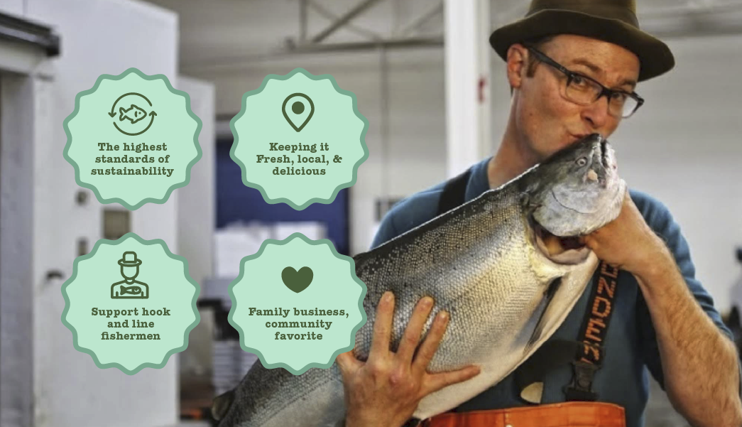
The site was restructured and redesigned to remove the friction. Subscription plans are now laid out side by side so visitors instantly understand their choices. Delivery and pickup details are clear and transparent, and the sustainability story is highlighted in a way that builds trust instead of burying it. Calls-to-action stand out on every page, making it simple for someone to go from browsing to becoming a subscriber.
Results
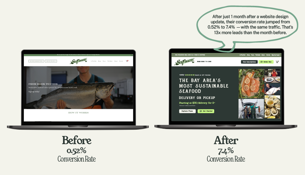
After just 1 month of the website redesign, the conversion rate jumped from 0.52% to 7.4% — a 13x increase in leads with the same amount of traffic. Over the next 5 months, the site maintained a strong conversion rate, consistently between 4.4%–7.4%, proving the redesign had a lasting impact.
The site was restructured and redesigned to remove the friction. Subscription plans are now laid out side by side so visitors instantly understand their choices. Delivery and pickup details are clear and transparent, and the sustainability story is highlighted in a way that builds trust instead of burying it. Calls-to-action stand out on every page, making it simple for someone to go from browsing to becoming a subscriber.
Results
After just 1 month of the website redesign, the conversion rate jumped from 0.52% to 7.4% — a 13x increase in leads with the same amount of traffic. Over the next 5 months, the site maintained a strong conversion rate, consistently between 4.4%–7.4%, proving the redesign had a lasting impact.