Problem
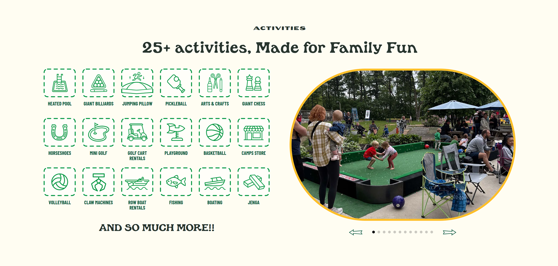
The campground had a strong destination and plenty to offer, but the website wasn’t doing enough to communicate the full experience or capture people actively searching for places to stay. Important information around accommodations, activities, amenities, and planning a visit needed to be easier to find and more engaging.
Solution
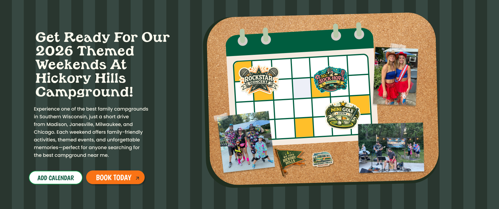
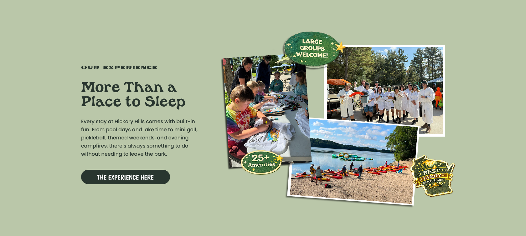
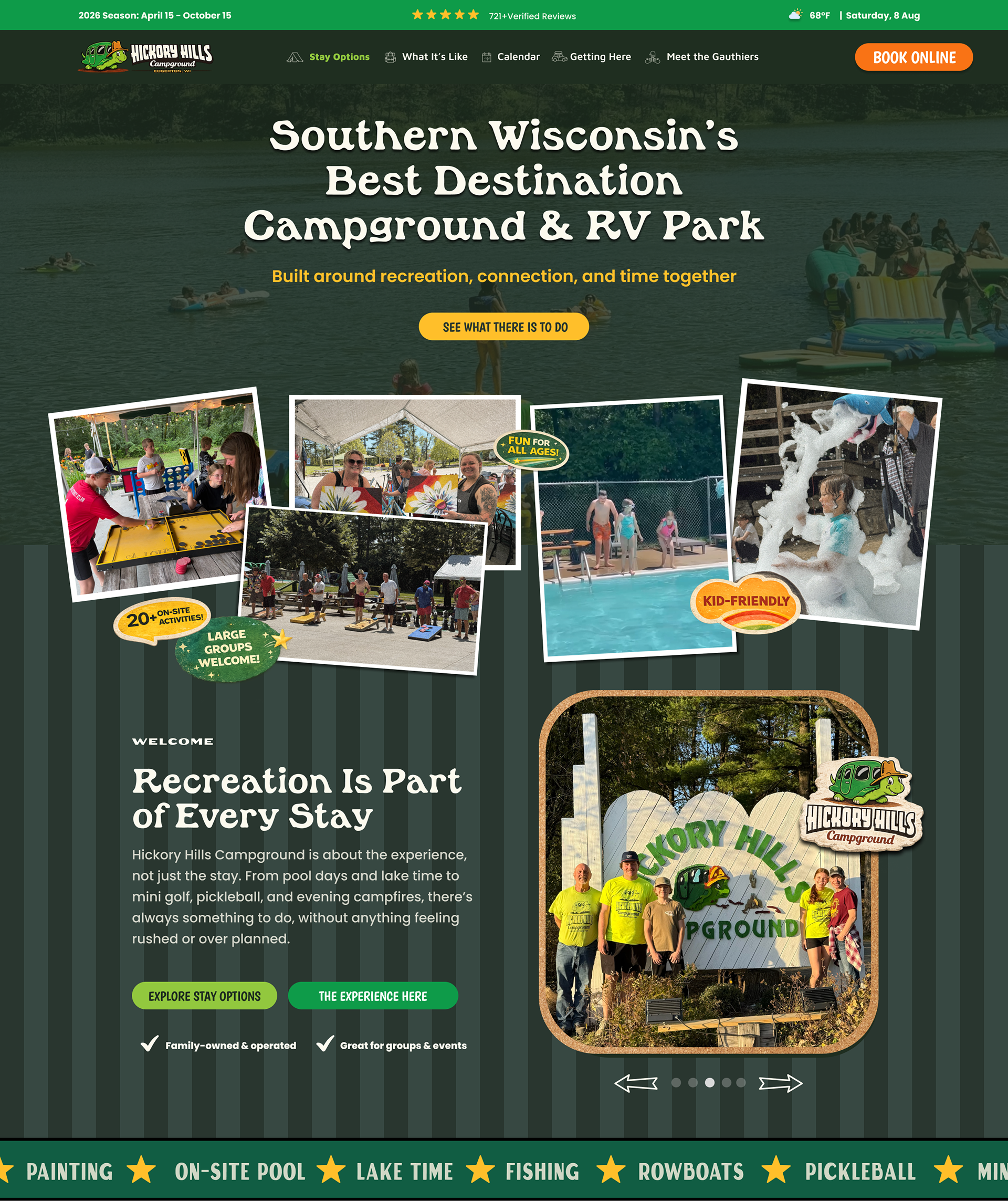
I redesigned the website around how guests actually research and choose a campground. Stay options, activities, seasonal information, and booking pathways were given a clearer structure, while the overall design was built to better showcase the experience of visiting Hickory Hills. The site was also structured with organic search and discoverability in mind, helping more potential guests find the campground without relying on paid advertising.
Results
Within the first 90 days, the website saw +886% growth in visitors and brought in 8.2K new visitors, all without paid ads. The redesign turned the website into a much stronger organic acquisition channel while creating a clearer path from discovering the campground to planning a stay.
Figma File:
Design Sections: